
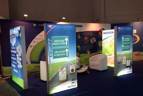
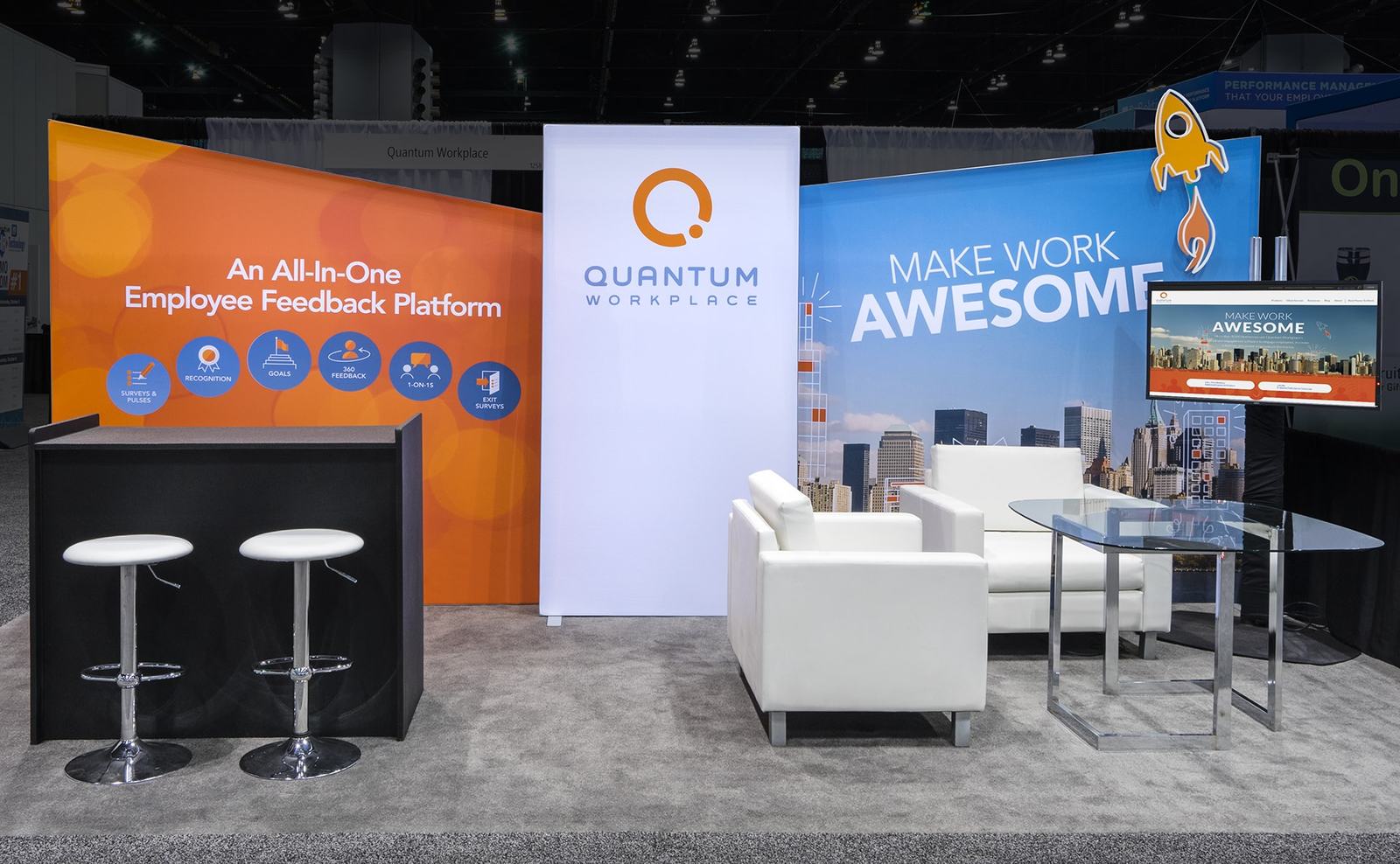
Developing poor graphics is a sure way to yield poor tradeshow exhibition results. The main purpose of the graphics is not just to create an actual representation of what you have to offer to your clients, and to make the booth look beautiful, but they should be designed to attract trade show attendees to your booth so that you can engage them. If you don’t have the right graphics, you are already curtailing your chances of having a successful display.
The process of designing theright graphics, however, is not one-time. This means that you will have to test a number of variables, designs, color choices, and pantone or hex colours before you land the right colour combination. It seems like a difficult and arduous task, but a necessary one, if you want graphics that will literally pull people towards your exhibit booth design.
The process of developing the right tradeshow graphics begins with using high quality ink. This allows the computer that will do the printing to call on the right combination of colors from the options available in the ink tanks.
Secondly, it is important to understand the disparity in the graphics you will be seeing in the computer monitors, and what the final output will look like – this is known as calibration. In most cases, and if you have a low quality monitor, the final product you will print, will always appear different than what was displayed on the monitor. To rectify this and to reduce the disparity, be sure to review the graphics samples and print previews on very good quality monitors.
Thirdly, the substrate upon which you are doing the printing will also have an impact on the quality of the tradeshow graphics. If you want the best results, then ensure that the paper or the graphics you are printing on is of the best possible quality.


